Today I completed the back cover for our CD casing. The problems I faced was trying to find the appropriate shot glass to place on the back and also choosing the right colour for the background. I started off with a dark grey, but after fiddling around with the gradient tool, I eventually stuck with the gradient going from light grey to white, and I also added lines I the corners and changed the colour of the text.
Wednesday, 19 December 2012
Saturday, 15 December 2012
Location Shots
For one of the locations in our video, we started using my living to showcase the point at which the lead band mates come round to help their friend take a load of from a long day at work but eventually after we had to re-shoot this scene, we used one of our actors houses instead.

Friday, 7 December 2012
Production Log
Today I scanned my story board into Photoshop but I also forgot to do my ancillary tasks which I shall be doing by next week. The problems I faced today on Photoshop was saving the images as a JPEG, once I saved them on to my usb they still came up as a Photoshop file, so I had to delete then resave. Eventually I came across another problem which was uploading my photos onto blogger; I then found out that I had to create a Picasa Web account to upload my photos on to the site. Once this was done I was able to load the first couple pages of my story board.
Production Log
Today I retook the photos for our magazine advertisement and the still images of the shot glass for the intro of our video. The problem I had with the camera was trying to focus the lens, but eventually I was able to do so and then using the tripod did not help because the camera had a different angle to it. So I decided to take the pictures free hand and they came out clear.


Friday, 30 November 2012
Production Log
Today I uploaded the pictures I took yesterday of the shot glass. I started to design the back of the CD cover, I dropped some of the images in and played around with the ones I thought looked best against the light brown background. The problem I faced today was the colour of the font for the title because Halima experimented using a gradient on the title for the advertisement but this didn’t work well with the background for the CD cover. They didn’t correlate well so I ended up leaving the text as dark grey whilst the background was a light shade of brown. I will continue to play around with different colours and images and see what work well with each other.
Tuesday, 20 November 2012
Production Log
Today Augustine
and I started shooting the very opening of our groups music video, Halima
unfortunately couldn't make it. We had slight issues of trying to find a table
cloth to place on the table. We eventually found one and had to iron it as it
was slightly creased. Once this was solved, we were able to get the footage we
needed.
Monday, 12 November 2012
Sunday, 28 October 2012
Music Video Synopsis
Narrative based story
line: displaying the end of a full day’s
work and this all shown through the first person perspective but also drifts in
and out from the third person perspective. The video alternates between the
band playing the song and the actual story line of the video. We start off with
our protagonist finishing up with some documents on the computer while he is at
work, he then leaves to go home to relax and his friends (the rest
of the band members) come by to pay him a visit with a bottle of alcohol. The protagonist then begins to take shots of
alcohol (in reference to the name of the song and the band) with his friends; he
is then seen to fall to the ground (as he has had 1 Shot 2 Many) due to his excessive drinking. The situation quickly
worsens as they begin trashing the house, they decide to go out which leads on
to the scenes on the street. While
on the street they are seen performing while intoxicated, they then bump into a
tramp and still continue to drink. They then continue to sing while the video
fades out at the end of the instrumental.
Music Video Prop List
Needed to show band performing (Chorus) 2x Bass Guitar
Full Drum Kit
Microphone
(including microphone stand)
Costumes
for all three characters
(When
playing as a band)
Needed for first setting (Workplace) Work desk
(including work chair)
Computer
Costumes for main
character (Work
Clothes)
Needed for second setting (House) Table
(in house)
TV
Bottle of
alcohol
3x
Shot glasses
Chairs/Sofa
Cushions
Costumes
for main characters friends
(Casual clothes)
Costume
for main character when he leaves
House to go out (casual clothes)
Needed for third setting (Streets)
2x Bass Guitar
Bottle of alcohol
Costume for tramp
Monday, 22 October 2012
1 Shot 2 Many Lyrics
Intro: ---------------------Instrumental---------------------
Verse 1 Starts at 00:20 seconds
It’s been a hard, hard day I could use a break
This job can get you down, make hard da take
And when I get home, I’m all alone
I kick of my boots, I twist on the bone
Chorus at 00:41 Seconds
And I don’t care, so get me out of here,
1 shot 2 many, 1 shot
1 shot 2 many, 1 shot
Verse 2 Starts at 00:56 Seconds
My friends stop over, at half past 5
With bottle in hand, I can swear he’s read my mind
He hands me a Johnny book of gilat
I take two swigs, I’m going down and I pass it dry
Chorus at 01:17 Seconds
And I don’t care, so get me out of here
1 shot 2 many, 1 shot
1 shot 2 many, 1 shot
Tonight I got that itch; you know my life’s a bitch
1 shot 2 many, 1 shot
1 shot 2 many, 1 shot
1 shot 2 many
1 shot 2 manyyyyy
1:41 Instrumental starts
------------------------------------------------------Instrumental-----------------------------------------------------
Verse 3 Starts at 2:26
Everywhere I go, it’s all the same
The rich get rich while we break a back and try to make a name
So then next time life
Makes you wanna yell
Just raise your glass, scream kiss my ass
And you can go da heeeellllll
Chorus at 02:48 Seconds
And I don’t care, so get me out of here
1 shot 2 many, 1 shot
1 shot 2 many, 1 shot
And now don’t touch my cup unless you’re filling it up
1 shot 2 many, 1 shot
1 shot 2 many, 1 shot
1 shot 2 many, 1 shot
1 shot 2 many, 1 shot
1 shot 2 mannnny, 1 shot 2 mannnny
1 shot 2 mannnny, 1 shot 2 mannnny
1 shot 2 many, yea, yea, yea
Yea, yea
Outro at 03:26 seconds:
---------------------Instrumental---------------------
Sunday, 21 October 2012
Artist Background - 1 Shot 2 Many
1 Shot 2 Many formerly Sire Grey (and before that, PRIDE)! They've taken up the name of a prior group one of their members was in, about a decade ago. They are 3 childhood friends who are still rockin' out together after all these years, with the addition of another long term friend rounding out the whole sound. Once projects, now a band, 1 Shot 2 Many is the culmination of 21 years of dreams, tears, and sweat. It is the newest incarnation of past bands and present situations. Four guys' vision of what Rock is lacking today, but not necessarily what it should be. Diversity and Singularity all rolled into one. A mix of hard rock, blues, and a hint of metal, the sound is uniquely their own.
Thursday, 18 October 2012

Saturday, 13 October 2012
Teacher's Comments No.1
Annabel,
An excellent blog so far with in depth analysis of a variety of media texts. Now you have researched media texts like yours you need to focus on initial audience research (find out about your audience) and then introduce the band and song you have chosen to those who mark your blog.
Targets:
An excellent blog so far with in depth analysis of a variety of media texts. Now you have researched media texts like yours you need to focus on initial audience research (find out about your audience) and then introduce the band and song you have chosen to those who mark your blog.
Targets:
- Complete and post initial audience research (questionnaire and results).
- Check your YouTube links for your video analysis, they currently come up as hyperlinks rather than embedded videos.
- Post some information about the band and the chosen song.
Saturday, 22 September 2012
Production Log
Today I completed two video analysis Wiley – Cash In My Pocket and Lady GaGa ft Beyonce - Telephone
Analysis of Wiley - Cash In My Pocket
This video was released on the 1st
December 2008; this song was off Wiley’s 5th studio album called “See
Clear Now” and the first Pop album he composed. Wiley is signed to Asylum
Records who are the subsidiary of Warner Music Group and this song generates from
the genre of Grime/ Electronic/ Pop and was produced by Mark Ronson. This is a
concept based video, creating the representation of what it is like within the corporate
world but showing it in a comedic way using satire.
The video starts off with a close
up of two white males in a car within the surroundings of central London- London
As soon as we enter into the
building we establish that the video is recorded by a hand held camera, which
enhances the verisimilitude of it being set in an actual work place with
ordinary office workers. As view this video
through someone else’s perspective, it’s an instinctive invitation for the
audience to indulge within the work place and feel involved within the video. A
long shot is shown for each person who has a few lines to say, whilst in the
background everyone else is getting along with their work, which creates the
effect of it being a normal day in the office and the use of the camera
switching from face to face also reminds the audience that they’re in a fast
paced working environment.
We continue to see more office
workers coming into the shot saying their lines- then we pan across the different
office cubicles whilst everyone inside is doing their own parts in a comedic
way which will entice the audience because they may find it humorous. Throughout
video it’s visible that the work place is predominately white male and female
workers, so once we see the small minority of the different ethnicities, it
gives the suggestion that the employment system is mainly based on 97% white
ethnicity and the rest of the 3% are other ethnicities- and that is shown
within the corporate businesses.
The video ends with some of the colleagues
crowed together walking towards the camera singing the lyrics, showing the
company is in unison and everyone is in it together. It then ends with a
pulling focus going out of the office building- which signals that the journey
within the office is over, and the workers are waving goodbye hoping that the
audience have enjoyed their stay.
Overall I think Wiley had a good
concept to the video because the lyrics of the song are in contrast to what is
happening in the video, and it makes it more exciting for the audience to
consume. Everything has been done in a comedic away to subvert the idea of what
office culture is like- so the director has chosen to make it less obvious but
also realistic by using officers workers to get a better approach towards the
video.
Analysis of Lady GaGa & Beyonce - Telephone
This video was released on
the 26th January 2010; this was Lady GaGa’s 3rd extended
play (EP) and off her second album “The Famous Monster”. Lady GaGa is signed to
Interscope Records, and the song generates from the genre of Electropop and
Dance-pop and was directed by Jonas Akerlund. This is a narrative and
performance based video, displaying the iconic view of Thelma & Louise
(1991), two criminals who are wanted by the police for committing serious
offences.
The video starts with a
long shot of Lady GaGa entering the county jail, whilst this is happening the
camera pans across some of the jails cells, and we see all the females up
against the bars, symbolising that they see fresh meat and they all want a piece.
The guards then strip her in her cell, which represent her being stripped of
her dignity for the crime she has committed- as they walk away one comments
“told you she didn’t have a d**k” relating to the hysteria that was made about
GaGa being a hermaphrodite, making a mock of the rumour by letting the audience
know that she’s gotten over it.
We see a close up of her
hair with diet coke cans as an alternative for rollers, and it’s known for
erupting once it’s mixed with mentos, which is significant to the fact that a
fight breaks out soon after this shot is shown of her. As she’s being bailed
out of jail, she breaks into an iconic MJ shuffle, paying tribute to him; this could
also link back to his video “Smooth Criminal”, reinforcing the idea that she is
one herself and is once again going to escape scot free. We then move into a
long shot of the symbolic “Pussy Wagon” which was used in Kill Bill V1-
indicating the point at which Uma Thurman also got away. Then enters Beyonce,
showing “Themla & Louise” being reunited again; they both share a Twinkie,
displaying the intimacy between them both- knowing that they’ll have each
others backs no matter what situation may suffice.
They then end up
committing their last big crime once they enter the Diner. A close up is used
to show Beyonce pouring a poisonous solution into Tyrese’s coffee, stating the
massacre is about to begin. We then see a montage of shots whilst GaGa is
poisoning the food orders, indicating they both want to go out with a bang to
make a final statement about their personas. We’re informed of Beyonce’s
wittiness because she pulls a not too convinced surprised look once Tyrese
collapses; enabling the audience to understand that everything they’re doing is
for a purpose.
Once everyone is dead within
the Diner, a long shot is used to show them both in their Wonder Woman attire,
using this juxtaposition makes the audience aware that they’re not heroes but
yet killers- so they’ve used this parody to enhance the situation that they’re
in to make it a form a satire.
The video ends with the
Pussy Wagon jetting off into the unknown, with both Lady GaGa and Beyonce
making a promise that they’ll never come back; this is then finalised with a
close up of their hands entwined together, showing the commitment they’ve made
to one another, and knowing that they’re content within their decision.
Overall this video
displays a postmodern text which uses intertextuality, parody and satire to
compliment an array of many videos, films and artist to pay tribute to their
work. This video would appeal to an audience of teenagers because its current
and it shows a sense of an edgy fashion which some may like. The story line is
easy to understand, whilst all the action will keep an audience entertained and
informed about the story they’re portraying.
Wednesday, 29 August 2012
Production Log
Today
I completed two video analysis of Rihanna – We Found Love and Katy Perry ft
Kanye West – E.T
Analysis of Katy Perry ft Kanye West – E.T.
This video was released on 16th February 2011; this was off Katy Perry’s 3rd studio album called “Teenage Dream”. Katy is signed to Capitol Records who are the subsidiary of EMI, which has recently been bought out by Universal, this video as directed by Floria Sigismondi. This song generates from the genre of Electronic Hip Hop and uses a Hybrid of concept based and a narrative based story line, creating the idea of falling in love with a foreigner and taking wide curiosity in something completely different.
In the beginning of this video a voice over is being played saying “where in the world is there someone for me?” whilst happening we see a pulling focus on a robot, subliminally indicating to the audience that this will be the person Katy’s falls in love with. Going into a long shot of a big spaceship within mid air, indicates that the concept is based around the idea of it being in space, showing the correlation with the title of the song. We then see a medium shot of Kanye doing his solo within the spaceship controlling the panels; this could be an invitation for the audience to join the experience he may want to take them on, this is through the dark mysterious background along with the flashing blue lights which could come across as being enticing. What an audience could suggest is that, he’s abducted her and is allowing her to have an outer body experience for her to seek for something she may like within that new world.
We then see a medium shot of an alien, which could represent Katy within a different body, which symbolises a different persona she’s taken on board whilst being in a new world. A long shot is used of her floating in space and the background is much more colourful showing the connection between her and the other world, then an establishing shot is used to display a deserted area with her descending down to be kindled with her lover. The robot is then showed again, as she steps closer to it the centre of its chest lights up, which is symbolic for the love it has for her; a bird’s-eye-view is then used to show her touching its heart, this can be inferred that she’s giving it a little piece of her and that’s what brings the robot to life.
Towards the end a close up is used to show their kiss, whilst this happens a beam of light engulfs their faces, finalising the point of which they’re now together and we finish of with an establishing shot of them holding hands, looking beyond the horizon at the new life they’ll share together. Around them the surroundings are much brighter than earlier in the video which signifies to the audience that they’re now content with one another.
Overall I think this video portrays an abnormal love story, and the use of a different concept enables this video to be more creative and it helps to tie in with the genre. This video would appeal to an audience of teenagers, and people in their twenties because it’s something different but it’s able to get its message across without the video being too over powering for the consumer to understand.
Analysis of Rihanna - We Found Love
This video was released on
the 22nd September 2011 and was on her 6th studio album
called “Talk That Talk”. Rihanna
is signed to Roc Nation, which is the subsidiary of Sony Music; this video was
directed by Melina Matsoukas.This song generates from the genre of Dance-Pop and
Electro House and has a narrative based story line, which could portray one of
her own relationships with someone, or basing it on what a relationship could
turn into within certain circumstances.
The video starts off with
an array of several different camera angles, made up of close ups/ medium shots
and establishing shots of them having fun and being intimate, creating a
picture of their relationship being in a good place; we then go straight into a
medium shot of Rihanna standing in front of a white wall with the image of
thunder across her and wind blowing in her face which implies a sign of
confusion or frustration because she’s moving from side to side and is not
willing to show her face.
She then says “We found
love…” and we have close up of a container, then the pills in someone’s hand,
into their mouth and we end with a dilated pupil, showing the significance of
the drug taking action- it also has the connation of them shrinking into their
own world as a couple, showing the audience that their in the same place at the
same time and they both feel happy. A straight cut is then followed with
another close up of them kissing and the room spinning fast- an extreme close
up is then used on a cigarette and it has the effect of multi-colours going
across it, which symbolises the hallucination they’re under.
Another array of different
angles is then shown of them in the supermarket, picking up alcohol and
spraying it on each other, and then they’re outside spinning around in a
trolley- portraying their everyday life style of getting drunk and being off
their heads, reinforcing the concept of them finding love in their own hopeless
place. A close up is used to show the significance of their life going to waste
by displaying them spending their money on a slot machine, the effect of
showing this will help the audience realise how secluded they are as a couple
and how they lock themselves away from society only to dwell within each other,
and the later effects are then shown of how the relationship is affecting both
of them. A birds-eye-view angle is used of their car going round in circles in
a dull location, signifying the idea of how their relationship works- them
always ending up in square one whilst things haven’t been resolved. This links
in with the next close up of the room once again spinning around but with Rihanna
covering her ears whilst he’s shouting at her, showing the build up of her
having enough and not being able to take anymore. Towards the end of the video
we see a long shot of her vigorously packing some clothes into a bag and
storming off, but then it ends with her sitting in a corner with her head in
between her legs, showing that she’s the lonely one and it concludes the idea
of her finally giving up within the relationship and taking time to find
herself.
Overall I think this video
allows its audience to get the representation of living life but also being
lost within love and not realising the bad side effects you may have with a
partner. All together it displays an image of what some relationships could end
like and advices people not to go down them same route and to be aware of what
you can get yourself into.
Friday, 24 August 2012
Production Log
I
completed two video analysis of Keri Hilson ft Kanye West & Ne-yo – Knock You
Down and The Pussycat Dolls – When I Grow Up
Analysis of The Pussycat Dolls – When I Grow Up
This video was released on
the 27th of May 2008 and was on their second studio album called “Doll
Domination”. This group is signed to Interscope Records, and the song generates
from the genre of Electro pop/ R’n’B and was directed by Joseph Khan. This is a
performance based video, and gives the representation of this being every girls
dream of becoming famous, and being known world wide and making it into
Hollywood.
The video starts off with
an establishing shot of the group in a car waiting in traffic, displaying
vibrant colours within the background and costume which enables it to entice
their audience; this could also be a reflection of their personalities showing
that they’re bubbly/ fun characters individually. We then have a close up of Nicole (main
singer) with sunglasses on which creates a barrier of protection between her
and the audience from getting to know her, whilst everyone’s eyes are visible;
this image is then replaced with a much more confident woman and it’s displayed
through the choreography, allowing the audience to understand her better. It may
suggest that they’re all ready for the whole world to realise who they are
because in unison they say “when I was younger I would say When I grow up”
symbolising the point at which they’ve stated they’ve made it to Hollywood
A close up is then shown
of their feet walking on Hollywood Boulevard signifying that they’re walking amongst with
the greatest stars and they’ve made their mark in the industry. A low angle is
then used whilst they’re standing on the bench signifying their high status and
importance, then a light appears through Nicole’s legs to show correlation with
the words she sings. We then see a
birds-eye-view of them climbing the construction site; this could suggest them
making their way to the top, representing strong female groups who can still be
prominent within the music industry and be successful. What an audience can get
from this is to inform them that girl groups are still triumphant within the
music industry and they still produce quality music for audiences to consume
and enjoy.
Towards the end of the
video Nicole is doing her solo and behind her, the groups name is in big bold
red font with flashing lights which would catch the audience eye and making it
more appealing for the audience. We then see her smash the screen, once again
implying their break through back into the industry and showing girl power. We
then finish with an establishing shot of them shooting a video whilst they’re
dancing with flashy cars around them displaying to the audience the life style
they’re living and can afford to live by working so hard by pursuing their
career.
Overall I think this video
allows its audience to see what its like to be determined in what you want to
become within the future, and it will allow people to be inspired by what
they’re talking about but relate it in a different context. The target audience
will be aimed at young teenaged girls because they’re probably easier to
connect to through music and they’ll be able to take something away from it.
Analysis of Keri Hilson ft Kanye West & Neyo- Knock You Down
This video was released on
the 7th of April 2009 and this was off Keri Hilson’s debut studio album
called “In a Perfect World”. Keri is signed to Universal Music Group, and was
directed by Chris Robinson. This song generates from the Hip-Hop/ R’n’B genre
and has a narrative based story line, putting across the message of being able
to make the right decision when it comes to love and who’s right for you.
Throughout the video the
representation being made is about the main artist trying to make her decision
on who she loves more. This is showed through a range of close ups, medium
shots and long shots. There’s a close up of Keri Hilson and Kanye West, him
behind her showing the intimacy between them both, symbolising their happiness,
that is then followed by a long shot of her facing away him with her back
towards him, whilst he is falling back, this could represent her rejecting his
love and then he crumbles into pieces signifying the end to their relationship.
It then goes into a
straight cut of Neyo doing his solo part which suggests he’s the new man in her
life; we then see a close up of both Keri and Neyo, with him behind her showing
that she’s happy and content.
Soon after the screen is
then spilt into two, whilst Kanye is doing his solo- on the other side we see
an array of moving images which match his words, speaking of the good times he
shared with Keri, but all these images are in black and white representing it
being in the past, and at the end both sides are engulfed within grey smoke
signifying all emotions coming to an end.
We then move into a medium
shot of all three artists, with Keri in the middle of both men, it suggests
that she is indecisive of who she actually wants, this links back to the
representation of being able to make your choice when it comes down to the
person you love, she struggles with this and runs away, displaying that she may
not be ready to commit to her reasonability. Both men are left staring at each
other, whilst a close up is soon then followed of her portrait, reinforcing the
idea of it all being down to her.
The last moving image is
another split screen of Keri with both men, one on each side, her holding their
faces, it creates the idea of her being satisfied with them both, but we see an
image of her falling onto a white bed, which could symbolise her finding
comfort within herself rather than the men- showing maybe she didn’t want
either of them. It could also symbolise her falling back into reality, because
the same image is shown at the beginning, so it could represent her being within
a dream.
Overall I think the
cinematography, mise-en-scene, editing and representation portray the idea of
Keri Hilson being indecisive about her choices. This video would appeal to an
audience of all ages because, anyone will be able to relate to this song if
they’ve been in a situation like this, and it enables the audience to
understand all three artists’ points of view, because we get an insight into
how they feel and it allows the audience to understand the song.
Wednesday, 22 August 2012
Production Log
Today
I completed two video analysis of Britney Spears - I Wanna Go and Ja Rule ft. R Kelly
& Ashanti - Wonderful
Analysis of Ja Rule ft R Kelly & Ashanti – Wonderful
This video
was released on the 28th of September 2004; this was of his 6th
studio album called “R.U.L .E”. Ja Rule is signed to Def Jam Records who are
the subsidiary of Universal Music Group, and this video was directed by Hype
Williams. This song generates from the genre of RnB, and has a narrative based
story line, the main message it is putting across to it’s audience from a males
perspective is “would you still want me if I wasn’t rich” and its questioning
the relationship which both males (Ja Rule and R Kelly) are going through,
trying to find the right woman.
In the video
the artists are being represented as them living the “gangster lifestyle”, this
is through showing close ups of them smoking cigars and them being in flashy
tailor made suits. It creates the
appearance of them being rich and able to afford that type of lifestyle.
Throughout the video we see two dominate colours being portrayed in different ways with the artists and the video girls; the white and black. White is showing the purity of the ones who are wearing it whereas the ones in Black are shown to have two sides to their personality; hence why both males go through more than one girl, showing the journey of them finding the right one.We then see a long shot ofAshanti
Throughout the video we see two dominate colours being portrayed in different ways with the artists and the video girls; the white and black. White is showing the purity of the ones who are wearing it whereas the ones in Black are shown to have two sides to their personality; hence why both males go through more than one girl, showing the journey of them finding the right one.We then see a long shot of
Within
mise-en-scene there’s an establishing shot of Ja Rule standing in a white
bedroom with him and the video girl both in black, this could symbolise him
indulging in pleasures that may satisfy him. A fade is used and a establishing shot
is followed of him coming down the stairs meeting another girl in black,
this then shows that he wasn’t satisfied, and the search for “Mrs Right” still
continues. This search is then put to an end once he has found his perfect
match, by displaying a close up of him and another video girl lying on a Yacht,
both dressed in white and sailing of into the sunset, it creates the picture
the “perfect” lifestyle once again, but this time with his special girl. This
then gives the message of patients is a virtue when it comes to finding the
right one, and it creates the illusion of this being an everyday lifestyle that
an audience can aspire to live like.
Overall the
use of representation, cinematography and mise-en-scene helps portray a picture
of a wealthy lifestyle, and it helps the audience to understand even if they
were wealthy, they’d still want someone to share it with but it’s just about
finding the right one. The different representations we come across enables
audience to connect wit the artist and sympathise for them, but then they feel
happy to know that one of them ended up with what they were searching for.
Sunday, 22 July 2012
Sunday, 1 July 2012
Teacher Feedback
Annabel you have made very good start to the A2 research work - well done! Please keep up this good work throughout the course.
Monday, 25 June 2012
Analysis of King’s Of Leon Advertisement

The print advertisement
for King’s Of Leon
The typography of the artist name and name of the
album is very bold and will attract an audience because its one of the main
conventions which stands out the most apart from the main image. Using this
type of typography would appear to the male crowd because it’s a masculine
font and it’s sharp rather than curvy; having red on the release date enhances
how important it is for consumers to go out and buy the album, it also provides
visual stimulation as it’s the only vibrant colour on the add.
With the main image the
artist has chosen to make his face look grotesque by combining the features of
an owl, this has correlation with the album title because owls are nocturnal
creatures who like to hunt for prey at night which could suggest why the whole
image has the green effect. Having the face disfigured suggests that he doesn’t
want people to see what he’s truly like and the owl features can imply his
other side to his music, trying to prey on the consumers to get a wider fan
base;
the typography could also
connect with the font that is displayed on a night vision camera. The colours
used are quite dark and dull which implies that this band originates from the
Rock genre, so this adheres to the stereotypical colours that you would usually
associate with Rock.
Analysis of Ne-yo Advertisement
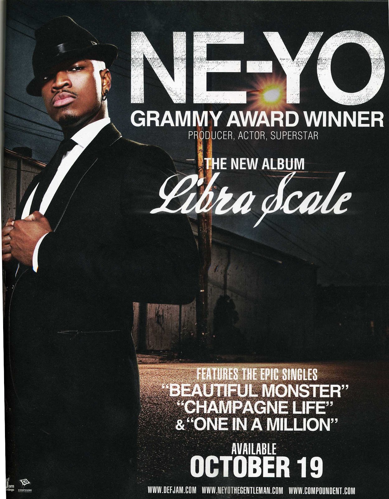
The print advertisement
for Ne-yo’s “Libra Scale” is likely
to be printed around October 2010 as this was when the album was released.
With the main image we se
that the main artist is in a suit which makes him look sophisticated, the white
connotes purity and elegance whilst the black connotes dominance. This look
contrasts with where the background is set, it appears to look grim and dark,
but the light behind the artist could connote him bring light into the darkness,
the light representing his sound and the darkness being the music industry
showing that he’s versatile artist. His posture implies confidence and that he
maybe untouchable this is given off by his body language and facial expression.
With the framing of this advertisement, they’ve placed him in front of the
background and his name and success showing that he’s been able to make it into
the music industry and people have noticed him and accepted his music “Grammy
award winner”.
With the background being
dark it allows the typography to stand out more because the white works well on
top of the black. The artists name is big, bold and sharp this enables it to
stand out the most out of all the text, the title of the album is written in a
italic font which compliments his style of dress, whereas his name ties in with
the setting. Overall the contrast with the main image and typography compliment
and correlates with each other because it shows the transition of rags to
riches through his career.
This would appeal to a
younger/middle aged audience because it showcases sophistication and the
boasting of his success may draw people in to entice them to buy the product
because they represent him in a good light. I think this may not be successful
as it could be because an audience could argue that the appeal of the
advertisement is slightly bland because it looks like the composition has been
done many times previously with other artist, but then again some may prefer
for it to be like this because its still appealing and gets it’s message
across.
Analysis of Rihanna Advertisement

The print advertisement
for Rihanna’s “Rated R” is likely to
have been printed around November 2009 as this is when the album was released.
Having the effect of black
and white subverts the idea of the genre this album generates from which are Pop
and Dance Pop; this is a good idea because the consumer may get the impression
that it may be filled with genres like Rock, R&B or Hip-Hop indicating from
the heavy make up around her eyes, dark lipstick, and her wearing leather
clothing and a lot of jewellery. The main image looks like its been torn from
paper this goes with the look she has, showing the hard side to her personality
- by her covering one side of her face makes it look like she has something to
hide away from her audience but it could be that she shows it within the album.
The typography works well with the
aestheticism of the album, it’s bold and prominent. The “R” allocated in the
top right corner could represent an arbitrary sign for her fans to recognise if
they’re apart of that culture, so this is a good way to brand her and the album
because people will notice it. The featured songs also correlate with the
persona that is being perceived from the artist; the body language gives of the
impression that she is “hard” and shows she may like to gamble within “Russian
roulette”. This advertisement may appeal
to it’s audience because it shows the different side to her, compared to
previous albums, this one shows her versatility as an artist and it displays
her coming out of her comfort zone and shell.
Overall I think this a successful advertisement because the simplicity
of it makes the add more interesting and appealing for an audience and it
diverts the idea of the Pop genre and what it would look like with vibrant
colours and interesting background settings. This would appeal to teenagers or
older because they may like the look of the artist within the fashion sense and
the type of genre the album is made up of.
Sunday, 24 June 2012
Analysis on Earth Wind, & Fire Album Cover

“Greatest Hits” was Earth, Wind &
Fire’s 2nd album of their collection of greatest hits, between 1973
– 1981; this album was released in November 1998. It was ranked number 12 and number 6 on Allmusic's list of the Top Funk and Smooth soul albums of all time respectively.
Looking at
Earth Wind & Fire’s album cover, it uses a range of vibrant colours which
complement the symbols and the name of the band. Using colours such as blue,
red/orange, green and brown represents the earth’s natural four elements of
water, earth, wind and fire which could connote the bond the artist have
together, and how they’ve stuck to their roots within their music to keep it
original for their audience. This may entice their consumers because it’s
colourful and it works well with the band’s name. The main image represents the
origin of Egyptian culture, by using symbols such as pyramids, this may
interest their audience because it makes the album seem mysterious and it may
intrigue them to want to know what inspired them as a group to be connected with
that particular country. Also each symbol can represent a part
of them and their personality.
With
typography its bold upper case lettering which enables it to stand out from the
cover, also by using white it allows the artists name and title to be more
prominent and noticeable for the consumer.
The title gives of the impression that this group have been around for
along time using words such as ‘Greatest’, symbolises experience within the
music industry and it showcases their talent as a group. The genre that they
derive from is American R&B and Soul, these genres might appeal to an older
audience because they were alive when the music was released or recorded, so
not many of the younger audience would prefer this kind of sound compared to
the current sound of R&B or Pop.
This album would’ve been successful
because all the elements link and work well together, there’s a good range of
colours being used and the main image stands out the most which will catch the
consumer’s eye; but whereas in some cases some people would not understand the
meaning of this main image, and the symbols on this cover may not appeal to
them.
Analysis on PJ Harvey Album Cover

“Let England Shake” was PJ Harvey’s 8th studio album after “White Chalk”, it was released in
February 2011 and took the period of 2 and half years to write the entire
album. It was named best album of the year in 2011 and won the Uncut Music
Award in November 2011.
Analysing this albums
front cover, it has a very simplistic look by only using black against white
and it has the title within the middle. The effect of the splashed black paint
filtering into little birds creates the illusion of a bird nest being shaken,
representing England and the
explosion being the music; indicating this album will be popular around England
The main image could also
connote a picture of a black hole, by not giving any signs of what the album
may contain and it gives off a mysterious look, or it can show the effect of
loud music being played and the movement of how birds flee away when they’ve
been irritated.
The title is what makes
the album stand out more because the typography is bold and written in upper
case lettering; also it looks like the birds are over taking the title which
creates a nice effect because it gives the impression of the artist’s music
taking over and getting a wider fan base.
This album doesn’t give
away what type of genre it may be but the effect of the birds fleeing could
suggest it generates from a loud genre such as Rock. This album may appeal to
teenagers or people over the age of 25 because it looks enticing and there isn’t
much on the album cover and that may appeal to them more rather than a lot
going on.
This album would be
successful because the simplicity of it makes it more intriguing and it would
engage the consumer and get them to make their own opinion of the album. I
think this album is branded well because you can’t tell it derives from the
Alternative Rock genre and it has a subtle approach and the main image has many
implications which an audience would like.
Saturday, 23 June 2012
Analysis on Gorillaz Album Cover

Looking at the Gorillaz
album cover we see that they’ve gone for a clean background by using black,
connoting dominance and gives a mysterious appeal to the album, the colour
doesn’t give too much away but looks enticing. The main image of the four
artists contrasts the purity of the white squares because it could represent
mug shots, and it could compliment the different characteristics of each
artist. By using the unique selling point of animated characters helps give them
a better brand identity, it draws in a different audience because they don’t
see the artist physically and the animated characters can symbolise their alter
egos or the other side to there personalities which they like to display to
their audience/ consumers. Also featured on the album cover is a tie – in which
will help entice the consumer to listen to that specific track and it
emphasises on how important or good it might be.
With the typography
they’ve used sharp upper case lettering which enables it to be more prominent
against the black and works well with it; the title of the album links with the
main image; “Demon” correlates with the eyes of the characters, and the black
once again showing the mysterious side of the album.
Using a Parental Advisory
sticker enables an open market for younger audiences to indulge within
profanity or sexual referencing, the effect of this shows that it works as a
promotional device to get them to buy this product and to fit within society
because, it’s seen as a new culture of the younger generation. Overall I think the simplicity of the colours and main
image could compliment their type of music but with the animated characters it
shows the intriguing side to their music which their audience will like most.
Analysis on Madonna’s Album Cover

“The Confession Tour” was Madonna’s 7th tour and 10th
album she recorded. This tour was released in May 2006 and successfully sold
194.7 million (US dollars) by putting on over 60shows.
Looking at Madonna’s album
cover the first thing which stands out is her name, this could connote she’s
fun and bubbly and it could show how the album will be up tempo and keep its
audience in suspense. The effect of the glow on her name creates and illusion
of her personality but then it contrasts with the main image and background
because it’s more dark and mysterious and represents her other side. With the main
image it has the static effect across her face which shows how she may keep it
old school within her music but her name is bright and shows there are still
some modern day aspects to the music she makes and it works well together. With
the album title it seems more personalised because it appears to look hand
written and it’s curvy; in comparison to the artist’s name which is in upper
case lettering and it has a bold/ sharp font. This may come across more sentimental
for the consumer and the title still has correlation with the artist’s name
because it shows the neon effect behind the text.
Also with the main image
it doesn’t give away too much to its audience which can be an advantage because
all the clues could be within the artist’s name; the O could represent a disco
ball which can suggest this album is filled with the genre of Disco or Pop and
these specific genres would appeal to teenagers or older.
Using the Parental
Advisory sticker would also appeal to a younger audience because they’re more
likely to take interest within profanity and inappropriate views/ opinions;
this shows the sign of being rebellious, and trying to fit in with society,
this sticker also works as a promotional device.
Over all I think this album cover would be successful because it works
well and even though there’s a contrast between the artist’s name and main
image, the colourful aspect will attract its audience and it not a common thing
to see within the genre of Pop or Disco because usually the album cover would
be colourful all over rather than on element.
Subscribe to:
Comments (Atom)