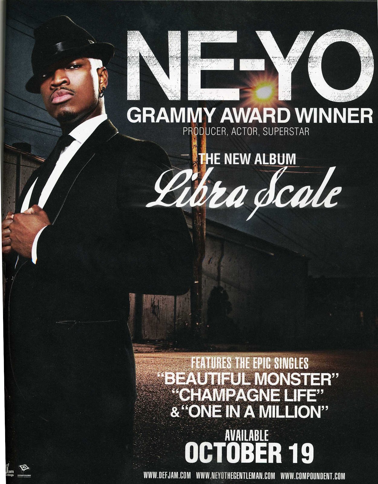
The print advertisement
for Ne-yo’s “Libra Scale” is likely
to be printed around October 2010 as this was when the album was released.
With the main image we se
that the main artist is in a suit which makes him look sophisticated, the white
connotes purity and elegance whilst the black connotes dominance. This look
contrasts with where the background is set, it appears to look grim and dark,
but the light behind the artist could connote him bring light into the darkness,
the light representing his sound and the darkness being the music industry
showing that he’s versatile artist. His posture implies confidence and that he
maybe untouchable this is given off by his body language and facial expression.
With the framing of this advertisement, they’ve placed him in front of the
background and his name and success showing that he’s been able to make it into
the music industry and people have noticed him and accepted his music “Grammy
award winner”.
With the background being
dark it allows the typography to stand out more because the white works well on
top of the black. The artists name is big, bold and sharp this enables it to
stand out the most out of all the text, the title of the album is written in a
italic font which compliments his style of dress, whereas his name ties in with
the setting. Overall the contrast with the main image and typography compliment
and correlates with each other because it shows the transition of rags to
riches through his career.
This would appeal to a
younger/middle aged audience because it showcases sophistication and the
boasting of his success may draw people in to entice them to buy the product
because they represent him in a good light. I think this may not be successful
as it could be because an audience could argue that the appeal of the
advertisement is slightly bland because it looks like the composition has been
done many times previously with other artist, but then again some may prefer
for it to be like this because its still appealing and gets it’s message
across.
No comments:
Post a Comment