Today I finished the analysis of the Rihanna, Ne-yo and King’s of
Monday, 25 June 2012
Analysis of King’s Of Leon Advertisement

The print advertisement
for King’s Of Leon
The typography of the artist name and name of the
album is very bold and will attract an audience because its one of the main
conventions which stands out the most apart from the main image. Using this
type of typography would appear to the male crowd because it’s a masculine
font and it’s sharp rather than curvy; having red on the release date enhances
how important it is for consumers to go out and buy the album, it also provides
visual stimulation as it’s the only vibrant colour on the add.
With the main image the
artist has chosen to make his face look grotesque by combining the features of
an owl, this has correlation with the album title because owls are nocturnal
creatures who like to hunt for prey at night which could suggest why the whole
image has the green effect. Having the face disfigured suggests that he doesn’t
want people to see what he’s truly like and the owl features can imply his
other side to his music, trying to prey on the consumers to get a wider fan
base;
the typography could also
connect with the font that is displayed on a night vision camera. The colours
used are quite dark and dull which implies that this band originates from the
Rock genre, so this adheres to the stereotypical colours that you would usually
associate with Rock.
Analysis of Ne-yo Advertisement
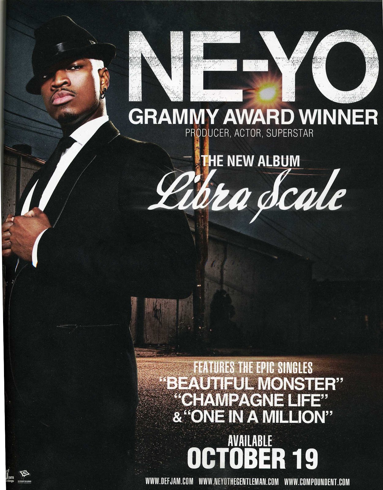
The print advertisement
for Ne-yo’s “Libra Scale” is likely
to be printed around October 2010 as this was when the album was released.
With the main image we se
that the main artist is in a suit which makes him look sophisticated, the white
connotes purity and elegance whilst the black connotes dominance. This look
contrasts with where the background is set, it appears to look grim and dark,
but the light behind the artist could connote him bring light into the darkness,
the light representing his sound and the darkness being the music industry
showing that he’s versatile artist. His posture implies confidence and that he
maybe untouchable this is given off by his body language and facial expression.
With the framing of this advertisement, they’ve placed him in front of the
background and his name and success showing that he’s been able to make it into
the music industry and people have noticed him and accepted his music “Grammy
award winner”.
With the background being
dark it allows the typography to stand out more because the white works well on
top of the black. The artists name is big, bold and sharp this enables it to
stand out the most out of all the text, the title of the album is written in a
italic font which compliments his style of dress, whereas his name ties in with
the setting. Overall the contrast with the main image and typography compliment
and correlates with each other because it shows the transition of rags to
riches through his career.
This would appeal to a
younger/middle aged audience because it showcases sophistication and the
boasting of his success may draw people in to entice them to buy the product
because they represent him in a good light. I think this may not be successful
as it could be because an audience could argue that the appeal of the
advertisement is slightly bland because it looks like the composition has been
done many times previously with other artist, but then again some may prefer
for it to be like this because its still appealing and gets it’s message
across.
Analysis of Rihanna Advertisement

The print advertisement
for Rihanna’s “Rated R” is likely to
have been printed around November 2009 as this is when the album was released.
Having the effect of black
and white subverts the idea of the genre this album generates from which are Pop
and Dance Pop; this is a good idea because the consumer may get the impression
that it may be filled with genres like Rock, R&B or Hip-Hop indicating from
the heavy make up around her eyes, dark lipstick, and her wearing leather
clothing and a lot of jewellery. The main image looks like its been torn from
paper this goes with the look she has, showing the hard side to her personality
- by her covering one side of her face makes it look like she has something to
hide away from her audience but it could be that she shows it within the album.
The typography works well with the
aestheticism of the album, it’s bold and prominent. The “R” allocated in the
top right corner could represent an arbitrary sign for her fans to recognise if
they’re apart of that culture, so this is a good way to brand her and the album
because people will notice it. The featured songs also correlate with the
persona that is being perceived from the artist; the body language gives of the
impression that she is “hard” and shows she may like to gamble within “Russian
roulette”. This advertisement may appeal
to it’s audience because it shows the different side to her, compared to
previous albums, this one shows her versatility as an artist and it displays
her coming out of her comfort zone and shell.
Overall I think this a successful advertisement because the simplicity
of it makes the add more interesting and appealing for an audience and it
diverts the idea of the Pop genre and what it would look like with vibrant
colours and interesting background settings. This would appeal to teenagers or
older because they may like the look of the artist within the fashion sense and
the type of genre the album is made up of.
Sunday, 24 June 2012
Analysis on Earth Wind, & Fire Album Cover

“Greatest Hits” was Earth, Wind &
Fire’s 2nd album of their collection of greatest hits, between 1973
– 1981; this album was released in November 1998. It was ranked number 12 and number 6 on Allmusic's list of the Top Funk and Smooth soul albums of all time respectively.
Looking at
Earth Wind & Fire’s album cover, it uses a range of vibrant colours which
complement the symbols and the name of the band. Using colours such as blue,
red/orange, green and brown represents the earth’s natural four elements of
water, earth, wind and fire which could connote the bond the artist have
together, and how they’ve stuck to their roots within their music to keep it
original for their audience. This may entice their consumers because it’s
colourful and it works well with the band’s name. The main image represents the
origin of Egyptian culture, by using symbols such as pyramids, this may
interest their audience because it makes the album seem mysterious and it may
intrigue them to want to know what inspired them as a group to be connected with
that particular country. Also each symbol can represent a part
of them and their personality.
With
typography its bold upper case lettering which enables it to stand out from the
cover, also by using white it allows the artists name and title to be more
prominent and noticeable for the consumer.
The title gives of the impression that this group have been around for
along time using words such as ‘Greatest’, symbolises experience within the
music industry and it showcases their talent as a group. The genre that they
derive from is American R&B and Soul, these genres might appeal to an older
audience because they were alive when the music was released or recorded, so
not many of the younger audience would prefer this kind of sound compared to
the current sound of R&B or Pop.
This album would’ve been successful
because all the elements link and work well together, there’s a good range of
colours being used and the main image stands out the most which will catch the
consumer’s eye; but whereas in some cases some people would not understand the
meaning of this main image, and the symbols on this cover may not appeal to
them.
Analysis on PJ Harvey Album Cover

“Let England Shake” was PJ Harvey’s 8th studio album after “White Chalk”, it was released in
February 2011 and took the period of 2 and half years to write the entire
album. It was named best album of the year in 2011 and won the Uncut Music
Award in November 2011.
Analysing this albums
front cover, it has a very simplistic look by only using black against white
and it has the title within the middle. The effect of the splashed black paint
filtering into little birds creates the illusion of a bird nest being shaken,
representing England and the
explosion being the music; indicating this album will be popular around England
The main image could also
connote a picture of a black hole, by not giving any signs of what the album
may contain and it gives off a mysterious look, or it can show the effect of
loud music being played and the movement of how birds flee away when they’ve
been irritated.
The title is what makes
the album stand out more because the typography is bold and written in upper
case lettering; also it looks like the birds are over taking the title which
creates a nice effect because it gives the impression of the artist’s music
taking over and getting a wider fan base.
This album doesn’t give
away what type of genre it may be but the effect of the birds fleeing could
suggest it generates from a loud genre such as Rock. This album may appeal to
teenagers or people over the age of 25 because it looks enticing and there isn’t
much on the album cover and that may appeal to them more rather than a lot
going on.
This album would be
successful because the simplicity of it makes it more intriguing and it would
engage the consumer and get them to make their own opinion of the album. I
think this album is branded well because you can’t tell it derives from the
Alternative Rock genre and it has a subtle approach and the main image has many
implications which an audience would like.
Saturday, 23 June 2012
Analysis on Gorillaz Album Cover

Looking at the Gorillaz
album cover we see that they’ve gone for a clean background by using black,
connoting dominance and gives a mysterious appeal to the album, the colour
doesn’t give too much away but looks enticing. The main image of the four
artists contrasts the purity of the white squares because it could represent
mug shots, and it could compliment the different characteristics of each
artist. By using the unique selling point of animated characters helps give them
a better brand identity, it draws in a different audience because they don’t
see the artist physically and the animated characters can symbolise their alter
egos or the other side to there personalities which they like to display to
their audience/ consumers. Also featured on the album cover is a tie – in which
will help entice the consumer to listen to that specific track and it
emphasises on how important or good it might be.
With the typography
they’ve used sharp upper case lettering which enables it to be more prominent
against the black and works well with it; the title of the album links with the
main image; “Demon” correlates with the eyes of the characters, and the black
once again showing the mysterious side of the album.
Using a Parental Advisory
sticker enables an open market for younger audiences to indulge within
profanity or sexual referencing, the effect of this shows that it works as a
promotional device to get them to buy this product and to fit within society
because, it’s seen as a new culture of the younger generation. Overall I think the simplicity of the colours and main
image could compliment their type of music but with the animated characters it
shows the intriguing side to their music which their audience will like most.
Analysis on Madonna’s Album Cover

“The Confession Tour” was Madonna’s 7th tour and 10th
album she recorded. This tour was released in May 2006 and successfully sold
194.7 million (US dollars) by putting on over 60shows.
Looking at Madonna’s album
cover the first thing which stands out is her name, this could connote she’s
fun and bubbly and it could show how the album will be up tempo and keep its
audience in suspense. The effect of the glow on her name creates and illusion
of her personality but then it contrasts with the main image and background
because it’s more dark and mysterious and represents her other side. With the main
image it has the static effect across her face which shows how she may keep it
old school within her music but her name is bright and shows there are still
some modern day aspects to the music she makes and it works well together. With
the album title it seems more personalised because it appears to look hand
written and it’s curvy; in comparison to the artist’s name which is in upper
case lettering and it has a bold/ sharp font. This may come across more sentimental
for the consumer and the title still has correlation with the artist’s name
because it shows the neon effect behind the text.
Also with the main image
it doesn’t give away too much to its audience which can be an advantage because
all the clues could be within the artist’s name; the O could represent a disco
ball which can suggest this album is filled with the genre of Disco or Pop and
these specific genres would appeal to teenagers or older.
Using the Parental
Advisory sticker would also appeal to a younger audience because they’re more
likely to take interest within profanity and inappropriate views/ opinions;
this shows the sign of being rebellious, and trying to fit in with society,
this sticker also works as a promotional device.
Over all I think this album cover would be successful because it works
well and even though there’s a contrast between the artist’s name and main
image, the colourful aspect will attract its audience and it not a common thing
to see within the genre of Pop or Disco because usually the album cover would
be colourful all over rather than on element.
Subscribe to:
Comments (Atom)